
Lazy M6 Capital Partners
Agency: Incubix
Role: Graphic Designer
Lazy M6 Capital Partners is a real estate investment firm focused on acquiring, improving, and managing income-based housing. The firm identifies and finances low-income properties, adds long-term value, and delivers stable, conservative returns to investors. Lazy M6 partners with accredited investors seeking safer, tax-advantaged alternatives to traditional investments—often professionals looking to build long-term and generational wealth through real estate.
THE BACKGROUND
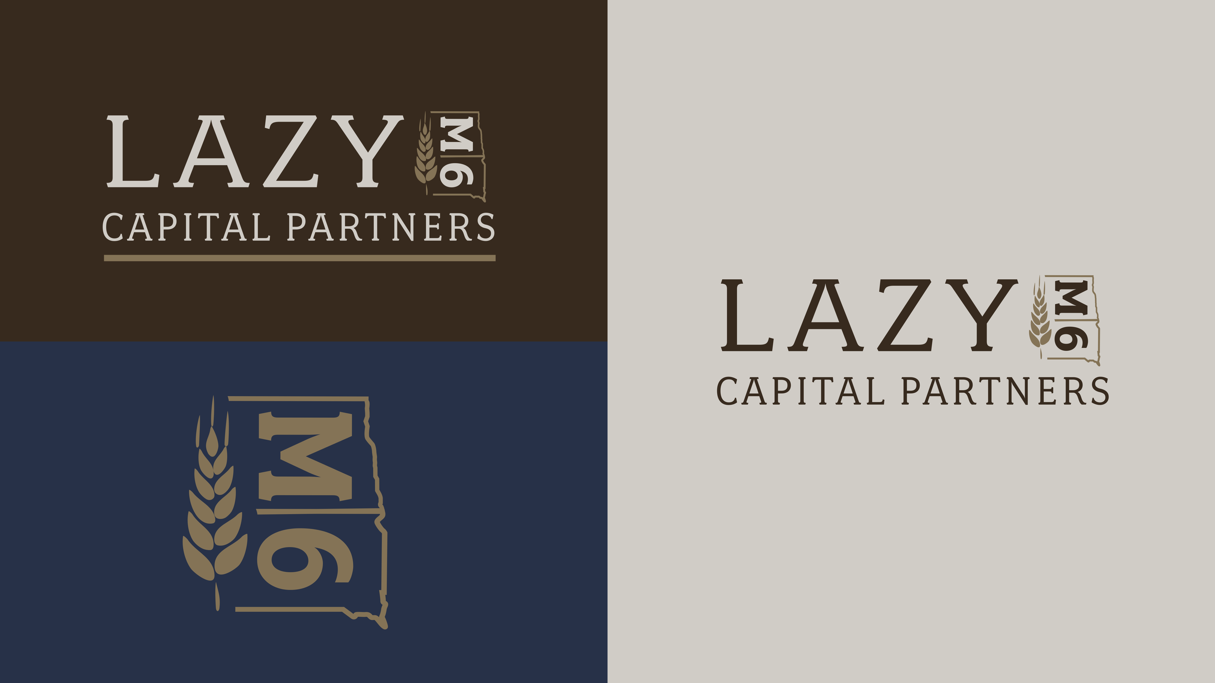
The brand name “Lazy M6” was derived from a historic family cattle brand. In cattle branding, a sideways letter was referred to as “lazy,” giving the mark its name and meaning. The client wanted the logo to reflect this heritage, potentially incorporating elements such as North and South Dakota, and wheat—symbols tied to the family’s roots and the regions where the company began and operated.
THE ASK
Respected, Midwestern, Family Oriented
SYMBOLISM
The symbol incorporates imagery representing both North and South Dakota alongside a wheat icon, reinforcing strong Midwestern roots, reliability, and agricultural heritage. It is classic and established, allowing the structure and composition of the logo to feel modern while still honoring regional roots.

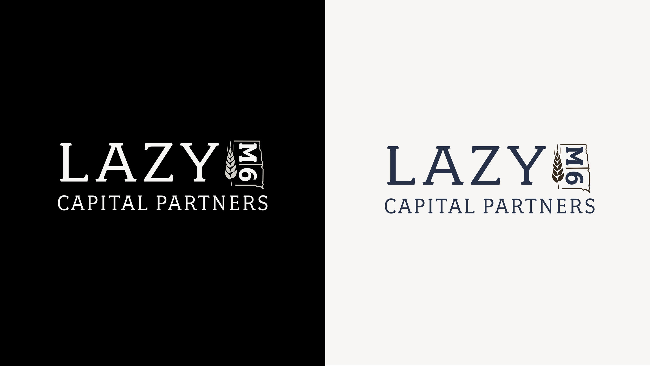
COLOR
A neutral palette of browns, golds, and greys establishes warmth and dependability, while subtle hints of navy blue add depth and professionalism. The overall tone feels timeless, safe, and investment-forward.
TYPOGRAPHY
The typeface conveys professionalism, confidence, and sophistication while still aligning with the Midwestern, family-oriented foundation of the brand.